


In case you haven’t noticed, Mommy A-Z is going through a bit of a make-over! No more chevron and clutter – just a fresh, clean, simple and pretty design. I’ve been working very closely with a designer Aileen Barker for over a month. Here’s my Blog Design board on Pinterest that I put together for inspiration.
Now that it’s live, I’m loving the design and layout but I’m yearning for more when it comes to the blog color palette. I like the orange and teal, but the palette I picked ended up looking pale and unsatisfying:
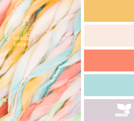
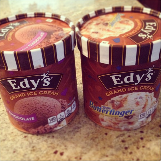
I wish I could just make up my mind. I blame my indecisiveness on the fact that I’m a Libra. Damn you, zodiac sign! This. is. so. hard. I mean this is way harder in comparison to last week when I had to decide which ice cream to eat for dessert:
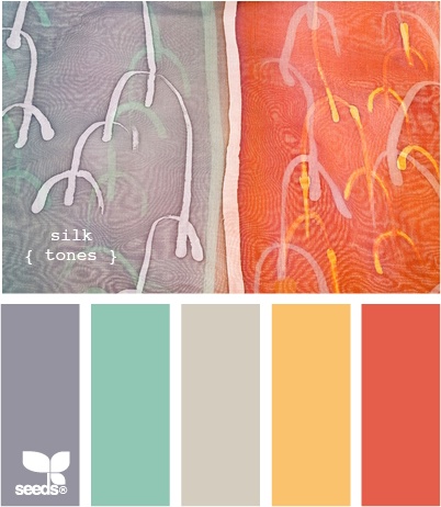
I still plan on keeping grey and yellow as secondary colors, so for this exercise please just focus on the orange and teal combos:
1. Silk Tones
2. Threaded hues

3. Spectrum Hues

4. Plated Hues

5. Color roped

Dizzying, isn’t it? I’d appreciate any input or opinions on the color or even comments on the overall design. Thanks for helping!
xo // gracielle.


Those are all so pretty! I do not think you could go wrong with any of them. Great choices!
Raquel @ Organized Island recently posted…Pepper and Broccoli Pasta Salad
Thanks so much for stopping by, Raquel! I think I’m going forward with Spectrum Hues 🙂
Gracielle recently posted…The Nightmare Patio Project with a Happy Ending {REVEAL}
Spectrum hues! I love the pink…but I may be biased! Lol
Taylor Brione recently posted…Macy’s Trendspotter Event June
You’re spot on, Taylor! I finally decided on Spectrum Hues. Thanks for weighing in 🙂
Gracielle recently posted…The Nightmare Patio Project with a Happy Ending {REVEAL}
I vote for the threaded! Such gorgeous colors! Stopping by from the #SITSSHAREFEST. Also am your newest bloglovin follower!
Thanks for stopping by, Ida! What’s your blog url? I tried visiting you, but got an error. I’d also love to follow you on bloglovin, so send me that url too!
Gracielle recently posted…The Nightmare Patio Project with a Happy Ending {REVEAL}
I like #3 – Spectrum hues. It’s not too muted, but not too bright either. Visiting from #Sitssharefest~
Lisa @ The Golden Spoons recently posted…Finish The Sentence Friday – The Best & Worst of Blogging
Thanks for stopping by, Lisa! I’m totally going for Spectrum Hues! Seems like it was the popular vote, plus those colors make me really HAPPY.
Gracielle recently posted…The Nightmare Patio Project with a Happy Ending {REVEAL}
I like the colors you have now, but the others you posted are nice too. I really like the plated hues palette…love that purple!
Stacey recently posted…This one time, at the camp out…
Thanks for stopping by and weighing in, Stacey! You and my mom voted on plated hues. I love that purple, too, but decided to go for Spectrum Hues.
Gracielle recently posted…The Nightmare Patio Project with a Happy Ending {REVEAL}
First of all, I’m now following your Pinterest board – what a great resource. I’m going to redesign my blog this fall so I appreciate that you’ve already done a lot of the legwork. I love your design – clean, easy to navigate and read. My only unsolicited suggestion would be to maybe have a categories tab at the top – I like the a to z theme of A is for… and you have to scroll down pretty far to get to it. Having the categories up top may get a new reader to stick around longer…just a thought. As for color, I like what you have, but it is more dusty coral and blue than orange and teal (which is still lovely, but you say it’s more muted than you’d like). My favorite is the threaded hue palette – the third and fifth colors. They would really pop against the white and gray background, and the combo is fresh and modern. So there is my two cents (ok, more like 50 cents).
Dana recently posted…Summer Book Reviews
Here’s what stands out to me. You did not follow “One” color board. You have the almost watercolor tones of the teal and orange (which I love) but there is no gray on the {color twist} board. The gray and white stripes are taking over….they are stronger than the teal and orange. If you look at the gray in Threaded Hues, it is paired with deeper teal and orange tones. I LOVE Spectrum Hues, in fact the teal and lime green are almost the same as my current colors. I could go add the salmon, orange, or fuchsia to my site and it would all work together 🙂 I have been married to a Libra for 23 years, so I know how hard this is for you! Pick one color palette (board) and follow the exact color codes for them to work together. I’m a Taurus, you ask me a question, I’m going to give you my honest opinion! Good luck 🙂
Lisa @ Cooking with Curls recently posted…Best of the Weekend {14}
I loved your assessment, Lisa! Thank you! I also love spectrum hues so I’m going with that…Seemed like the popular pick, but when it came down to it, it’s the one that made me really happy!
Gracielle recently posted…The Nightmare Patio Project with a Happy Ending {REVEAL}
#3. Its more of a calm set of colors!
Thanks for weighing in, Stephanie! I’m going with #3 because it makes me really happy! Also seemed like the popular palette among the readers!
Gracielle recently posted…The Nightmare Patio Project with a Happy Ending {REVEAL}
Hi! I am stopping over from the SITS linky party. I am going through the same thing, right now. I like my theme and design, but I am starting to be underwhelmed over the colors. I keep looking at color scheme tools, but there are so many beautiful colors…how do I use all of them? 🙂
For your choices, I personally like #3 and #4. Lots of pretty colors and they seem to pop out a little more. But, it all depends on what you are looking for. Are you looking for something with lots or color or something softer?
Good luck, with your final choice.
Susan recently posted…No Internet Connection…
Thank you so much for your input, Susan! Spectrum hues is on the top of my list right now. I think your blog colors are great – purple, blue, pink, green, and you can’t go wrong with grey as your back drop color 🙂
I like color roped and spectrum hues. I totally feel your pain on this. I’ve been playing around with my blog lately. I got a new theme but then wasn’t happy with how overpowering the color was so I made a change. Now it’s mostly white with a thin border. it’s a little plain now and I don’t have a logo but I’m working on it. Good luck making your decision!
Melissa recently posted…Casual Friday
good luck with a logo! I was thinking about adding it to the design, but had a hard enough time just with the colors! Thanks for stopping by!
Gracielle recently posted…The Nightmare Patio Project with a Happy Ending {REVEAL}
Spectrum!! No contest!
Jen @Making Our Life Matter recently posted…#WordlessWednesday~Meet Chicago
After staring at all the color palettes for the past few weeks over and over again…I would say that I definitely agree with you! Spectrum Hues it is! Thanks for chiming in 🙂
I totally see why this is hard!! I kept looking at your different color combos and saying, “Oh, that’s great. That’s the combo I like.” Then, “Oh, THAT one is gorgeous, too!” You can’t go wrong with any of them. I’d go with what makes YOU the happiest. We chose our colors because they made us smile and feel good. There are a lot of pretty potential combos out there, but one or two probably speak to you more….or at least it worked that way for us!! –The Dose GIrls
The Dose of Reality recently posted…Pinterest Nightmare #625: The Hibermate
Thanks, Dose Girls! Looks like I’m going with Spectrum Hues! You’re totally right – I’m going with the colors that makes ME the happiest.
#3, definitely! It is just such a pretty color combination. Bright and sunny!!!
Jillian @ Baby Doodah! recently posted…What I Ate Wednesday – # 5
I’ve been all over the place with my blog, too! It’s so hard with so many choices, but I love your look! Happy SITS Day!
Rachel @ Architecture of a Mom recently posted…Easy Wallpaper Art